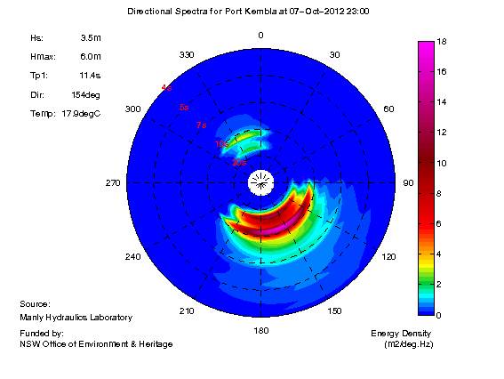
MHL has updated its presentation of its live wave data to directional wave plots. This gives an easy, intuitive picture of the wave energy present at the buoy.
The plots show the direction and period of swell conditions, and are especially useful for showing different swells that may be in the water at one time.
Over the next few months this will be rolled out to all of the NSW buoys. Port Kembla plots are live and can be viewed at:
new.mhl.nsw.gov.au/data/realtime/wave/DirectionalSpectra-portkembla
The plots are easy to interpret; just look for the strongest colour and read off the direction and period. Don't worry about the numbers of the colour scale, the combined wave height is given as text on the left. The example below shows a strong swell from the South at around 8seconds, and a second swell from the SE at around 12sec.
Hope it helps your time on the water!
Thanks to NSW Office of Environmment and Heritage for funding the Waverider program.
Hmm, looks very interesting, thanks for sharing! ![]()
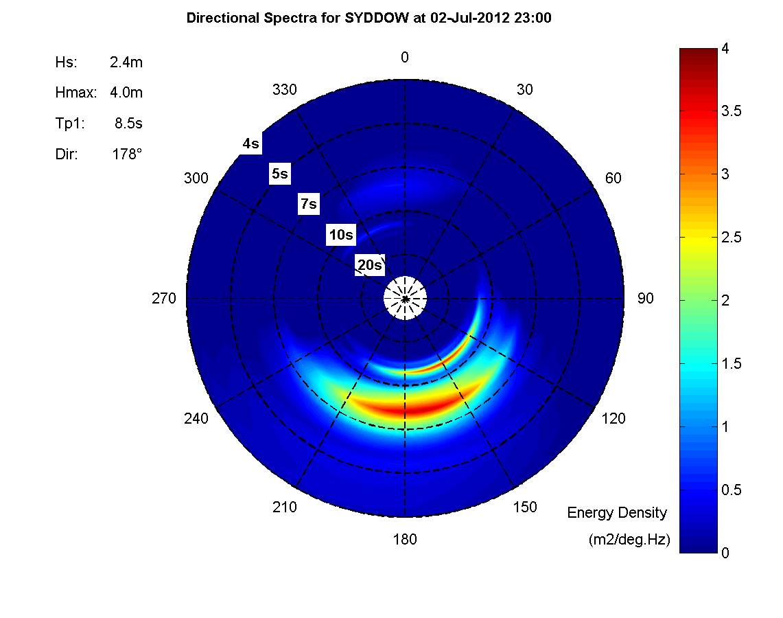
Except that this is what I see for Sydney waves right now.. ![]()
![]()

Unfortunately we can't make waves by colouring in the plot. But it was much more interesting over the weekend.
^^^ Interesting - is the swell coming from the north west the south easterly swell reflecting off the land?