Hi All,
Cleaned up the look & feel of the forums .. check it out, and share your thoughts before it goes live... ![]() (...oh .. and let me know of any errors!)
(...oh .. and let me know of any errors!)
Also, site has been also been upgraded for easy access via iPhone / Android...
www.seabreeze.com.au/forums/
Checked it out on the ipad and was like whoa baby it was huge but on the laptop looks great,nice and clean dont know why its so big on the ipad maybe my settings?
Yeah .. sorry, should have mentioned the iPad is still being refined...
Fear not, those font sizes will come down, and you'll also be able to switch to the "standard" view of it all, as well. ![]()
Looks great on mozilla
Android ICS 4.03 default browser has a page offset to the left on forums page. No thumbs option either![]()
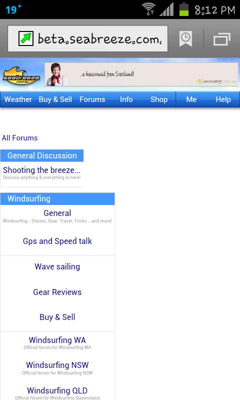
Looks pretty good. Yeah the font size for the ipad needs to reduce. Also, let the descriptions on the forums wrap onto multiple lines so each forum at the top level is the same width, the extra width makes it look like a sub forum, not as intuitive to navigate. But otherwise looks and feels sweet!
Thanks for this site and forums, it adds so much to the kiting experience.
Like the look and feel, however the site doesn't auto adjust to fill the page based on the monitor resolution\window size.
If i maximize the window the main section of the page doesn't utilise the full width. (the header does)
In the old site it does. It means i'm not seeing as much content as i could in the active window.
Occurs on Safari, FF and Chrome (PC+MAC)
... hey Laurie, found a mistake, you still have windsurfing, I thought it was cancelled........ just joking,,, flame proof jacket on now!!
I like, i like, feedback however:
Text box resizes (on android phone) so that i cant see what in typing. comment must be written in one go with no mistakes or attempts to fix spell or grammar errors. hence robot talk to minimise risk of mispelling or whatever.
Also is there an option to upload pic from phone? I dont see it.
Good work. keep it up. cheers.
An update from all the feedback so far.
If you're keen and able, and want to be involved it making it the goodness, do take time to check it out again...
1) iPad fonts/sizing all fixed up
2) Android failing click on menus all fixed up
3) "Try to please all the people all the time fix"
Let me explain this one: I'm in favour of the fixed width in the middle design, as it prevents the "watching tennis" effect, however, do understand others prefer the wider format. So... at the very bottom of the page, you'll find a "Widescreen | Fixed" option where you can choose!! Happy days for all.
Do give the fixed width a go before you dis it, as it has been widened a little.
4) Drop shadow has been lightened
5) Some whitespace dropped, although with all the white, there's still a lot of white.
6) Sorry, no fix for the overflowing text just yet..
.. all the other features requested have been logged, but staying focussed on layout for all the devices at the moment.
Lots of testing: Mac Safari/IE, Windows IE7,8,9,/Safari/Chrome/FireFox, iPhone3/4, iPad, HTC Phone, Samsung Phone & tablet .. sometimes just going around in circles .. fix one, the other broke, but we're getting there with your help! ![]()
It's all good stuff .. it won't go live, until everybody the majority are happy with where it's headed ![]()
Here you go:
www.seabreeze.com.au
Would there be any way to keep it the same for computers and laptops etc, but when you use a phone it goes to the mobile site.
Bit like www.sportsbet.com.au (sorry only one i could think of...), on computer you get the full site, and on the phone you can chose to have the full site or the more phone friendly mobile site.
Dunno if it's meant to be, but there is no edit button after you make a post for those little changes we sometimes need to make.
Thanks sk1nner! ![]()
The beta has just been updated again, and looking good.
Please do let me know if it's working/failing/not looking good for you.
Testing is via Mac's, PC's, iPhone, iPads, Android and all the major browsers Google, Firefox, IE, Safari, so it's easy to miss something.
Feel free to PM me, or upload images of failed layout... it's your forum and really keen to get the visuals right for you. ![]()
www.seabreeze.com.au
If I check a post on the forum then go back to the general page, the post previously read was seen in a red colour so I know instantly where i was in the list of post and can check the next one easily, with the beta,it doesn't happen so I have to scroll with my eyes the whole list to find the last one i read.
What about a discreet mode without all the colours and flashiness. So I can check the weather forecast and conditions at work without worrying who's looking over my shoulder.
Maybe make the weather graphs look like an excel spread sheet!
A minor gripe, but on an iPhone4 when I drag my finger over the wind readings the little box that comes up with 'gold coast 10:32am wind 18 knots Waves 1.4m' is up quite high and is normally cut off by the top of the screen. I hope this made sense. Otherwise all good
Hi Laurie,
facelift looks great, really clean.
Not sure if the links from the Weather page (WA/Metro) are meant to be working - tried the WA Forecast and get a Server Error.
Cheers
Thanks fellas : fixed the server error, and moved the iPhone hover box around (fonts still need tweaking) ... Can't do much about the lesbian supply... or Excel spreadsheets! (good ideas though)! ![]()
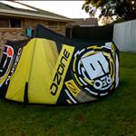
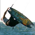
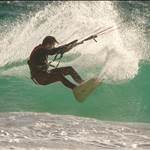
GOUT Man .. tested the image upload, seems ok, and I see you got your big air photo up.
Since each account has its own logging, How about a feature on the graphs where we could click to mark any particular day as spent on the water.
This would need to work with an option to search for a define period and we could find out for instance over the last 12 months i spent 68 days on the water.
You could eevn link it to our profiles for bragging rights![]()
![]()
![]()