Vote if you want to but don't give your email address unless you want spam from the design website
Please pls pls go & vote. So far the winning design is total carp YUK YUK YUK. Id be embarrassed to see it as our logo.
You dont get to see the polling till uv voted but I'll give you a clue - the first one you see (imo the worst of the worst) is currently no. one.
I sorta like the one by the same artist (its obvious) with the looping green & gold kites.
But they would have to put a bit more 'low aspect' into the kite. Look more like ribbons than kites (obviously not a kiter)
My no. 2 is the green gold kite with the stars. Thats pretty OK
IMO disappointing all round - nothing at all out of the box but we will end up with one of them - apparently.
Heres the link :
99designs.com.au/logo-design/contests/kiteboarding-australia-ka-needs-logo-208099/poll/90uob8/done?utm_source=voting_app&utm_medium=email&utm_campaign=voting
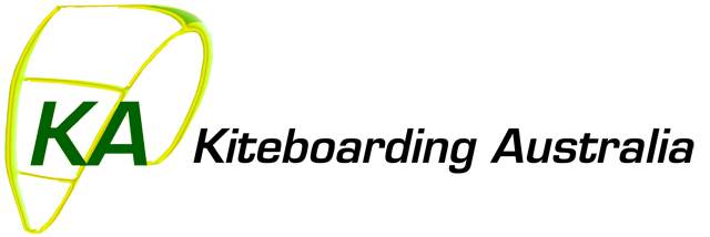
I think that Kiteboarding Australia (KA) has done a piss poor job organising our new logo. Yes they advertised the fact that we need a new logo on seabreeze but they didn't give fellow kiteboarders enough time to design a logo let alone register to become a designer. They even forgot to include the website link. Luckily it was added by someone else.
KA hasn't even asked any of us to vote for the winning design once the final designers were chosen. BTW The winning designers were not chosen by us kiteboarders. Final voting was not advertised on seabreeze by KA / AKSA or State Association websites. WTF
I thought that the Directors of our new Association were required to act in the best interest of our Sport as outlined in its Constitution. And why do Individual kiteboarding members of Kiteboarding Australia not have any voting rights. This is done by the board of our State Associations. Each State Association will have 1 vote by its nominated delegate. BTW The delegate is appointed by the State Association board, not by its members. Go the buddy system. The KA Board is also elected by the State Associations not by its members. Having said that I think that the State Associations have also let us down as they have done little to involve individual kiteboarders in the design of the logo. They have also provided limited information regarding the formation and proposed board of our new national body.
BTW When will KA be incorporated? As far as I can tell it is not even registered yet. Who will be the fifth Director? Its Constitution requires that there be five Directors but from the limited information provided to us there are only four at the moment.
The design website chosen by the KA Board also sends spam to your email if you vote.
Great job so far KA Board!!! Is this how you represent our sport?
ok guys - i have felt the need to register just so i can comment and represent the designers a bit. Of course you are all entitled to your opinion, and as graphic designers we are all used to criticism, but just remember you dont have all the facts. You dont know how the comp worked, the conversations that took place or the original brief etc.
Graphic designers design logos. Just because you kite doesn't make you a graphic designer. Do you think graphic designers become proficient in every industry they design for??
Logos aren't always meant to be literal – the “ribbons” aren't meant to exactly replicate kites. They are suggestive only and are DELIBERATELY designed to look that way. Logos need to be multi functional – they need to be able to be used across a broad platform of mediums -embroidered, screen printed, mono, low res, high res, recognisable etc etc.
And for the record: i have about ten kites in my garage, can quite adequately launch and crash my partners kite, and love the sport. I was super disappointed for all kiters it got canned from the olympics and hope it gets back in.
Puppetonastring - I dont mind that you dont like my designs, but i do mind you commenting without all the facts.
Im sorry you feel annoyed about the process from KA but it is what it is. That issue is with KA, not the poor designers having a go!
I've voted in the Logo comp but at best find the designs pedestrian.
KA why weren't we as members told about this without sufficient notice? & given the chance to design our own logo before you contracted an online service?
What else do you have planned???
Again. How can you say things like that when you have no idea!!!!! I'm sorry, I didn't notice you in the corner of my lounge room while I was sitting on my couch sketching THUMBNAILS on paper with a pen.
luluvic you are obviously taking criticism of your artwork personally which is understandable. I've been in the creative industry for 30 years, get over it move on and do better next time.
My comments were aimed at Kitesurfing Australia and why we as members weren't given sufficient notice to submit our own designs.
@ luluvic
you obviously didnt read my post too well.
Yes I canned your first design but if you read on I also gave an imo that your other one with the looping kites was my favourite. I even made mention of the fact that the designer of my 1st & last choice was one & the same.
I can see no reason why the "ribbons" that are (to a kiter) looping kites cant have a bit more graduated shape to make them recognisably kites at a glance from anyone. There are 1000s of logos around far more complex than that which are easily catered for in every medium. Look at the very fresh Woolworths logo - color, B & W, embroidered on every staff members hat etc etc.
A logo is meant to give visual representation of what it portrays - a rule not always followed but one which should be.
A logo should be a stand-alone symbol. You shouldnt have to rely on the text written name every time you use it. If the 'ribbons' of your looping kites were more kite shaped they would be far more recognisable when & where KA dont want to use the text component. Eg Woolies again. "the fresh food people". How much fresher can you get than having a "BIG W" in a complex spiral which is immediately recognisable as a "W" & as fresh apple peel. AWESOME - someone deserves a raise on that whole deal.
Im not having a go at you personally luluvic. Im encouraging people to have their say and, as I no longer have any direct input to KA (AKSA), I felt I had to have put my 2c's worth in here.
We are all going to have to have live with the outcome and while I dont think it is appropriate for a poll of members from all walks of life (but very few with marketing qualifications or experience) to select the "best' design apparently this is how this one is going.
IMO there are only 2 worth even considering - but hey if its popular choice then thats the democracy we live. All too often (again imo) it results in the lowest common denominator.
I'll bet you it wasnt a poll of customers & staff of Woolies that voted in the apple peel. You need real marketing expertise to create masterpieces like that as well a skillful team of consulting reps to explain to board level decision makers why its so good.
Sorry if I offended luluvic - I just happen to think these things are important.
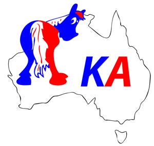
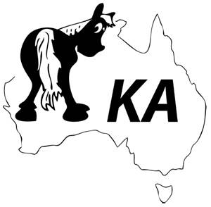
Just went back for another look - luluvic your design which I hate is still no.1 but the green & gold southern cross has come up to 2nd place. Funnily enough your far better design (imo) is lagging way back - sad to say.
But thats just a FYI comment.
What I was checking for was the use of the text to accompany the logo. As I remembered - every single entry has incorporated the full title of Kiteboarding Aust.
It is supposed to be a logo comp NOT a letterhead comp.
For sure its valid to present a 'logo' to a client with alternative surrounds which could be used in different situations. But if a logo has to have the full title of the entity it is representing then its NOT a 'logo'. Or at least not a very good one.
Take the Kiteboarding Australia text away from each of the entries before you vote. Which one do you like best then?
But as I suggested earlier it shouldnt be up to us amateurs to decide. It also shouldnt just be graphic designers on the job at this stage.
Logo design needs the input of marketing experts to come up with concepts that will represent the org. effectively. Not knocking graphic designers - they are amazingly talented people & the only ones that can do the creative work to produce the required images. But the concept behind the image is the essential foundation and that isnt getting a look in here.
Thought this was a good spot for a reminder. Don't forget that volunteering some time for your local, state or national kiting club/association/whatever is far more useful than criticising it, constructive or otherwise. ![]()
IMO, it would be a travesty to KA members to wear or have associated with the current poll leading supposed new KA logo on the 99designs website of the type Luluvic has designed. There is more emphasis put on the letters KA with an unbalanced, intense, awkward, aggressive, busy, angular design that is all about the letters and nothing to with kiting or the feel of kiting whatsoever. Apart from some tack on after thought like "Oh I had better tack a symbolic, minimalistic, possible, kite sort of thingy, representation that hardly looks like the shape of a true kite and hang it somewhere, Oh look, there is a spot off the corner, so that people might identify on the off chance, that it may have something to do with kiting" and "Oh I had better put a miniscle mape of Aussie in there somewhere so people might be able to tell its Australia if the have bionic vision".
When I come to think of it, it would not have been to hard to bias the voting position or favortism of a design by possibly having many friends and aquaintences vote to be able to push their submission to the top of the ladder and it would only stand to reason a designer being enthusiastic and passionate about their design in a competition to get or have their friends and aquaintances try to back them. Instead of something based on it's merits of good design. Not to say it has happenned in this case but there is nothing saying it could'nt be influenced in that manner.
Please accept that I am not taking a personal attack or to disrespect, discredit, Luluvic as a designer or their ability or reputation, only their designs on this occassion, I feel, has missed the mark.
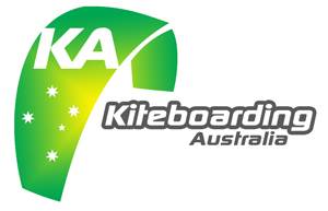
Whereas the entry by Windy Wocket with the Green & Gold and unmistakable dominating more true Kite shape representation logo proporting the Southern Cross looks and feels something I would more identify with that it has some importance and feel about it that it represents a National Australian Organisation involved in Kiteboarding. Out of all other logo submissions this is the one that I feel even comes close to representing an image of our sport that is undeniable an Australian sport in it's image apart from Sir Rowdy's earlier unoffical entry depiction of Aye's Rock etc ![]()
I agree with all other comments that there should have been more and better notice to the Kiting community and KA members to have more time, chance, and voting to come up with other submissions that may have been far better choices to represent our sport for it's future. But if there is no other alternatives then I only hope that KA has some forsight and wisdom to see that Windy Wockets submission is the better of the two current top submissions.
I feel I am saying this with some level of ability as I have been involved with design for over 30 years. Please accept I have no affiliations with either the two designers, just that I feel strongly enough that it's something KA should get right for the betterment of our sport.
Wasnt having a go at you Tazza. As you can see I tried to answer some concerns because; as you say; this a forum where people should raise these issues and where others should fill in the blanks where they can. All good - great in fact.
The best way to get action though - rather than answers - is to raise your concerns directly to your state KSA body. Emails make it easy. I know WAKSA was always hot on 1) responding & 2) raising members concerns/opinions etc at every meeting.
Forum banter is followed by those c'tee members who are into the forums but it is always just reported as 'trends' rather than specific feedback.
My 'dont complain act' comment was meant purely as encouragement for kiters to put more into your sport rather than simply sitting on the sidelines criticising what those who are in there doing it are coming up with. We are a very young, growing & evolving sport with a growing & evolving set of KSA's & the KA. Its the prehistoric era of development so Im the first to agree it needs to develop into a mature association. It takes time; & a lot input from a lot of different people with different skills to offer; to make it come of age.
But the bottom line is - if you could see it from the inside & from the past - YOUR state & national bodies are rocketing ahead along that path.
here is what some of our international couterparts have
internationalkiteboarding.org/index.php?option=com_content&view=article&id=537&Itemid=185
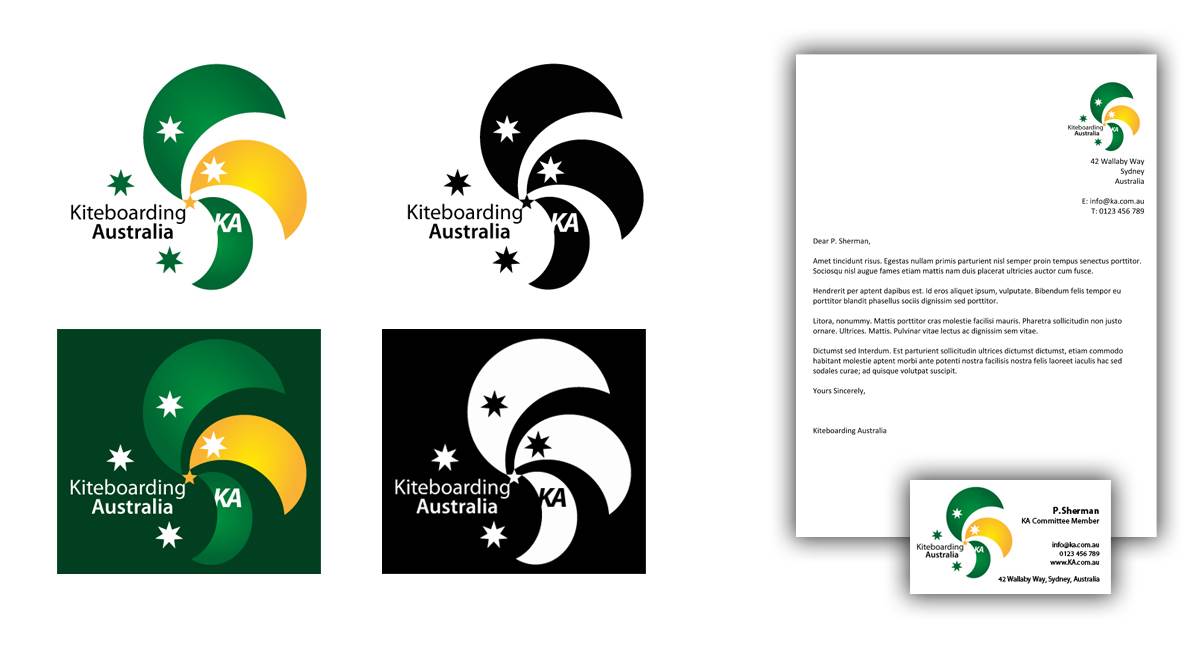
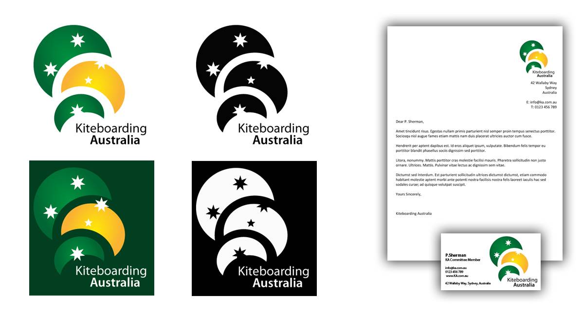
I was very surprised of the short time frame and lack of feedback KA gave the designers. My design, that is currently second, was an initial design and was chosen over my more develop designs :(
I'm no professional but think I have a keen eye for design and I was a little disappointed. I researched other international logos such as kitesurfing, sailing, olympic, etc and thought my developed designs stood up. Let me know what you think. KA said they looked to much like moons, which is fair enough. But the Spanish, Canadian, and French Kiteboarding Federations and the IKA must also think that kites look like moons too ;)
Initial design
Developed designs
I agree with you 100% windywocket.
Im not up with the selection criteria but I think its 99 Designs themselves that choose the finalists. ??
Your 'developed design' No 1 is pretty impressive IMO.
(not so enamoured by your developed design 2 - more unbalanced & unrecognisable as kiting logo)
If No1 kites are too 'moon like' to be acceptable then surely a bit of wingtip on the end of each kite would solve that minor problem.
Fact is my guesstimate is 60% - 70&% are on deltas these days anyhow :-) Pretty moony shape there.
For my money all Id be looking for is the KA to move to just above centre of the kite and put forward the concept that the Kiteboarding Aust. text could be included or deleted to suit the publication. IMO your logo says it all - as logos should - with or without the text.
Quite often orgs which are relatively little known need to present a logo along with tags before they reach a stage of recognition where the logo can be stand alone.
Depends too on the publication. In the case of your developed logo 1 it would probably be sufficient on say emails to members etc but would be better with the text on banners to outsiders.
I strongly suggest you forward your developed no.1 logo direct to KA via email & alert them to this forum discussion. They are all very reasonable reps 7 normal everyday kiters with nothing but the best interest of kiting & kiters at heart.
Last thing they want is to do the wrong thing. Im sure this whole 99 Design logo comp program was seen to be an effective way of ensuring a 'best possible' option could be found.
Im sure too they will take onboard ALL feedback from where-ever to help them do it to best possible outcome. You dont put in the hard yards to voluntarily to come up with anything but the best possible results of your efforts.
ps excellent work too submitting the samples of possible print jobs - top stuff.