Select to expand quotejksmurf said..
Not bad not bad... I can live with it, eventually..
However I echo the comments about it looking a bit bloated... I tried to find a setting for smaller text (yeah I I know I can mouse scroll or ctrl scroll the whole webpage but that makes everything smaller), as In the posts are essentially a strip occupying the middle thrrd and theres white space for Africa each side?
Also really pale. Like sickly; any chance of changing the background colours at will?
Hehe. Cool!
Can I ask what device you're using? i.e. 13" laptop, 29" desktop?
Regards "Pale" .. have you tried "Dark" mode? Tap the Profile at top right.
Just had a look into this, and adjusted various fonts/avatars/colours, and side-by-side comparison with old site, and the new site actually uses less space for the same text now. but with a bigger more readable font. 🎉
Select to expand quoteSeabreeze said..jksmurf said..
Not bad not bad... I can live with it, eventually..
However I echo the comments about it looking a bit bloated... I tried to find a setting for smaller text (yeah I I know I can mouse scroll or ctrl scroll the whole webpage but that makes everything smaller), as In the posts are essentially a strip occupying the middle thrrd and theres white space for Africa each side?
Also really pale. Like sickly; any chance of changing the background colours at will?
Hehe. Cool!
Can I ask what device you're using? i.e. 13" laptop, 29" desktop?Select to expand quoteMaybe a 22" Desktop Screen Select to expand quote
Regards "Pale" .. have you tried "Dark" mode? Tap the Profile at top right.Select to expand quoteYeah.. it's .. very black.Select to expand quoteSoooo there's like White .. or Black... I guess I can live with that too, just with somuch screen space, all white, lying in bed at night or early morning it is sort of blinding (...cue 'blinded by the light...' )
It's better already, thanks.
Are you able to tone down the blue in the main bar somewhat? It feels like it's burning my retinas.
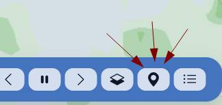
I like the radar image shortcut - was it on the old site? I've never noticed it before. BOM always needed 4 or 5 clicks to get there. Now it's impossible on the BOM.
JonE,
BOM 128km radar image, old style (the best!): https//reg.bom.gov.au/products/IDR023.loop.shtml
Select to expand quoteJonE said..
It's better already, thanks.
Are you able to tone down the blue in the main bar somewhat? It feels like it's burning my retinas.
I like the radar image shortcut - was it on the old site? I've never noticed it before. BOM always needed 4 or 5 clicks to get there. Now it's impossible on the BOM.
Hehe.. as much as a glaring sun off the water at 3pm? 😅
Rain Radar is new! Loving it.
Don't tell anyone! Before we know it this site becomes more popular than BOM and it's overloaded.
Great addition!
The new site is shaping up well! Appreciate the hard work 👍
Couple of idea's re the forecast
- option to switch between the normal 10 day BOM forecast (ACCESS) and the more accurate 36 hr forecast (ACCESS-C)
- can you add wind gust speed on the graphs?
Ok, the blue's have been toned down a bit, and the desktop font size reduced, as was a bit large.
Select to expand quoteAI.Dave said..
The new site is shaping up well! Appreciate the hard work 👍
Couple of idea's re the forecast
- option to switch between the normal 10 day BOM forecast (ACCESS) and the more accurate 36 hr forecast (ACCESS-C)
- can you add wind gust speed on the graphs?
For sure, and it's a significant investment to subscribe to the ACCESS models from the BoM. A subscription option on Seabreeze will be available soon, which will enable the purchase of more data, and if enough people show their support, we can do add this, and EMCWF. 👍
As far as I can tell, everything is fixed/working, and no more issues?
Speak up now! 😅
Select to expand quotelaurie said..
As far as I can tell, everything is fixed/working, and no more issues?
Speak up now! 😅
The light mode still doesn't work for me through a browser (Duck-DuckGo), Galaxy A20.
Works in the Chrome.
Not a showstopper 👍
Select to expand quoteSo odd? You're using the new beta, right? And you go to the Profile menu at the top right, and choose the light theme (or via the Unit Preferences dialog), and it persists as dark theme?
It's a simple cookie "Theme=Dark", or "Theme=Light" .. if you're game, you could open the developer tools in your browser, go to the console, and type :
Cookies.set("Theme","Light")
It's that simple?! Got me beat. Anybody else suffing theme switching issues?
Man these mid post adverts are beyond annoying, it's like being on a ****ty Newscorp site where you endlessly scroll down but keep getting sent to the top of the page as the adverts load.
FYI. The sub-category Links in the Buy & Sell section are broken. They all link to the top level category. This is on Safari, Mac.
Select to expand quoteozzimark said..
Is this huge blank space at the top of the page intentional?
That would be caused by your adblocker. 😎
Select to expand quotestehsegler said..
FYI. The sub-category Links in the Buy & Sell section are broken. They all link to the top level category. This is on Safari, Mac.
Sorry for that, was a tempory issue. 👍
Select to expand quotecarbine said..
Man these mid post adverts are beyond annoying, it's like being on a ****ty Newscorp site where you endlessly scroll down but keep getting sent to the top of the page as the adverts load.
Sorry about that .. necessary evil to keep the lights on - but they should be that intrusive. Is it breaking scrolling, or ... ? let me know, as that's not on .. they should be static, non-layout shifting...Select to expand quotecarbine said..
Man these mid post adverts are beyond annoying, it's like being on a ****ty Newscorp site where you endlessly scroll down but keep getting sent to the top of the page as the adverts load.
Noticed with the new site, when I click the username/time of last post, it doesn't scroll to the last page and post anymore. On the old site, it linked to the last post but now it just links to the first post on the first page. Circled the place below.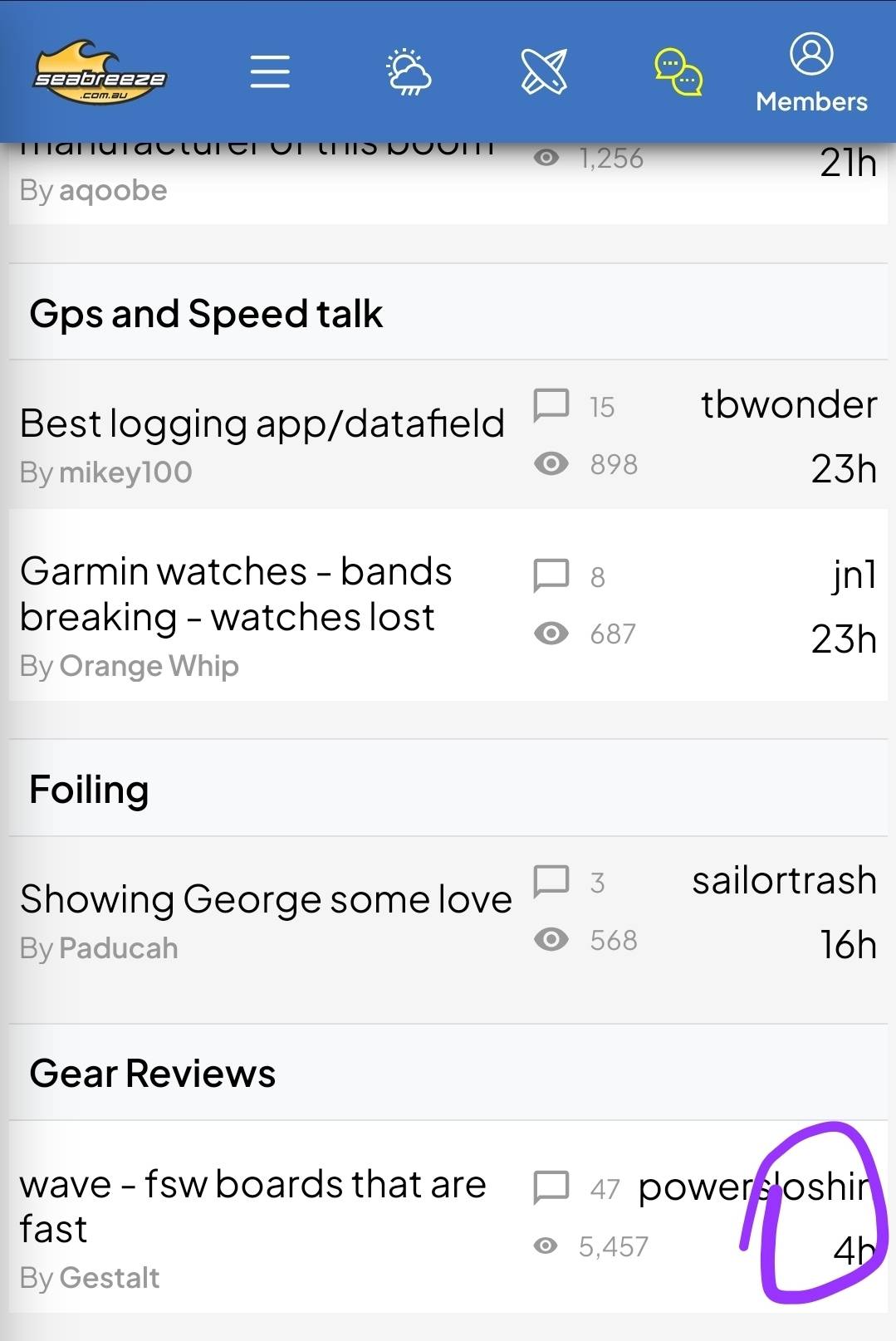
Hi Seabreeze........I like the new Website on the whole but I preferred seeing the high and low tide times under the graph like the old site.
Love the flag 👍
Keep up the good work
Hi Laurie, possible to have the date of last message in the summary, if older than one week? I enjoy to search in the past years in the GPS / Speed😎 Thanks 😀
Select to expand quotestonny said..
Hi Seabreeze........I like the new Website on the whole but I preferred seeing the high and low tide times under the graph like the old site.
Love the flag 👍
Keep up the good work
Absolutely .. missed that little guy on the rebuild. He's coming...
Select to expand quoteRonanL said..
Hi Laurie, possible to have the date of last message in the summary, if older than one week? I enjoy to search in the past years in the GPS / Speed😎 Thanks 😀
Sure. 👍 All done.
Select to expand quotelaurie said..ozzimark said..
Is this huge blank space at the top of the page intentional?
That would be caused by your adblocker. 😎
It seemed like it would be the right spot for an ad, but I have the adblocker disabled for Seabreeze - I ran a website long ago and recognize the importance of those ad views... checking with a clean browser install shows the ad, so there must be something else on my end. I'll dig into it, thanks.
Select to expand quotelaurie said..RonanL said..
Hi Laurie, possible to have the date of last message in the summary, if older than one week? I enjoy to search in the past years in the GPS / Speed😎 Thanks 😀
Sure. 👍 All done.
😎Perfect!👍
Select to expand quoteptsf1111 said..
Noticed with the new site, when I click the username/time of last post, it doesn't scroll to the last page and post anymore. On the old site, it linked to the last post but now it just links to the first post on the first page. Circled the place below.
Would love to see a fix for this in case that didn't make it onto your list yet 😊